Each month a new map is presented to the Commission to help explain important trends in the Bay Area, across the nation and around the world. These custom-crafted maps are prepared by MTC’s Data & Visualization team.
Each month a new map is presented to the Commission to help explain important trends in the Bay Area, across the nation and around the world. These custom-crafted maps are prepared by MTC’s Data & Visualization team.

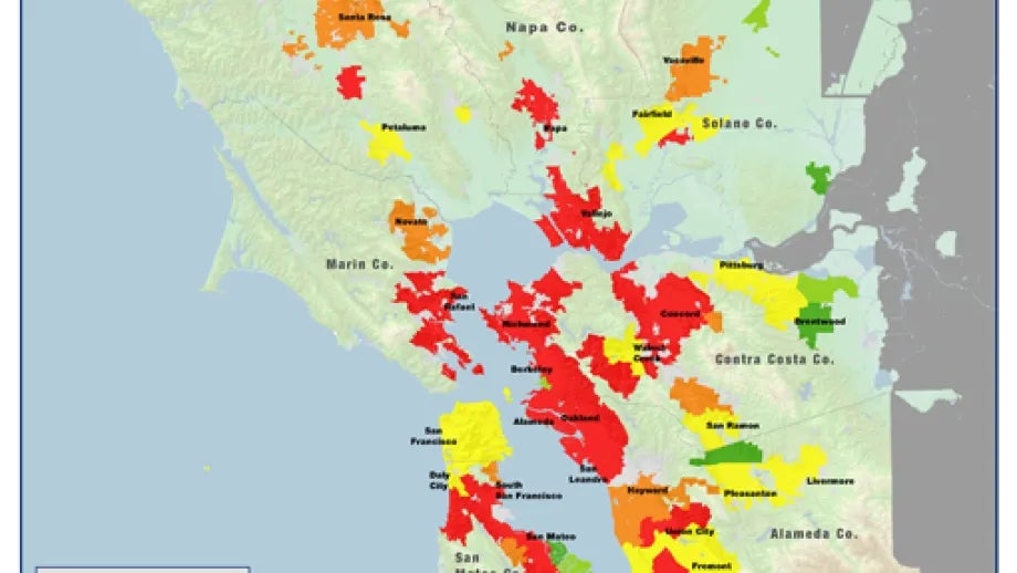
On May 1, 2014, the California Department of Finance (DOF) released city, county, and state population estimates updated through the end of year 2013, which includes detailed data on housing production for the San Francisco Bay Area. This map depGicts housing production performance in the San Francisco Bay Area in year 2013 for counties, subareas, and cities. Key conclusions from the map are summarized below: San Jose and San Francisco are acting as regional powerhouses for infill housing in the urban core. Exurban development is alive and well in the Bay Area, even while housing development has continued to stall in neighboring San Joaquin County. Cities along inner East Bay BART corridors produced little-to-no housing in 2013, while the Tri-Valley and eBART corridors saw robust growth. After San Jose and San Francisco, suburban communities like Dublin, Campbell, and Fremont were the top generators of new housing units in 2013 Based on housing production rates (% growth), the fastest-growing cities in the region were all in the eastern fringe of the region or in booming Silicon Valley.