Each month a new map is presented to the Commission to help explain important trends in the Bay Area, across the nation and around the world. These custom-crafted maps are prepared by MTC’s Data & Visualization team.
Each month a new map is presented to the Commission to help explain important trends in the Bay Area, across the nation and around the world. These custom-crafted maps are prepared by MTC’s Data & Visualization team.

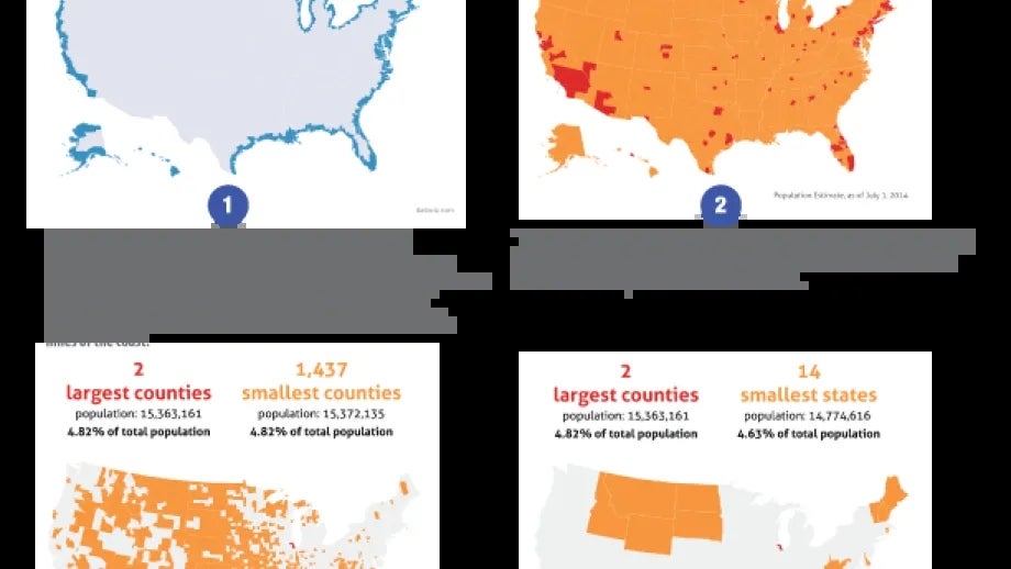
This map series highlights one of the most obvious and surprising facts about where people live in the United States. Most of the U.S. population live together in a few densely populated areas. While this is a well known fact, visual explanations of this characteristic can be quite striking. These 4 maps illustrate in different ways where we live, and how we actually inhabit so little of our country's space.Map 1 shows the coastal shoreline counties of the U.S., which are the counties that are directly adjacent to an open ocean, a major estuary, or the Great Lakes. According to 2014 Census data, 39.1 percent of the U.S. population lived in those counties, often within miles of the coast.Map 2 highlights the largest and smallest counties in the U.S. Roughly fifty percent of the U.S. population lives in the country's 144 largest counties, while the roughly other 50 percent lives in 2,998 counties. Map 3 compares America's two largest counties (Los Angeles and Downtown Chicago) with the 14 smallest states.Map 4 compares the population of these two counties with 1,437 of the country's smallest counties. Nearly 5 percent of America's population lives in the counties covering downtown L.A. and downtown Chicago, which is the same proportion as those that live in the country's 1,437 smallest counties.