Each month a new map is presented to the Commission to help explain important trends in the Bay Area, across the nation and around the world. These custom-crafted maps are prepared by MTC’s Data & Visualization team.
Each month a new map is presented to the Commission to help explain important trends in the Bay Area, across the nation and around the world. These custom-crafted maps are prepared by MTC’s Data & Visualization team.

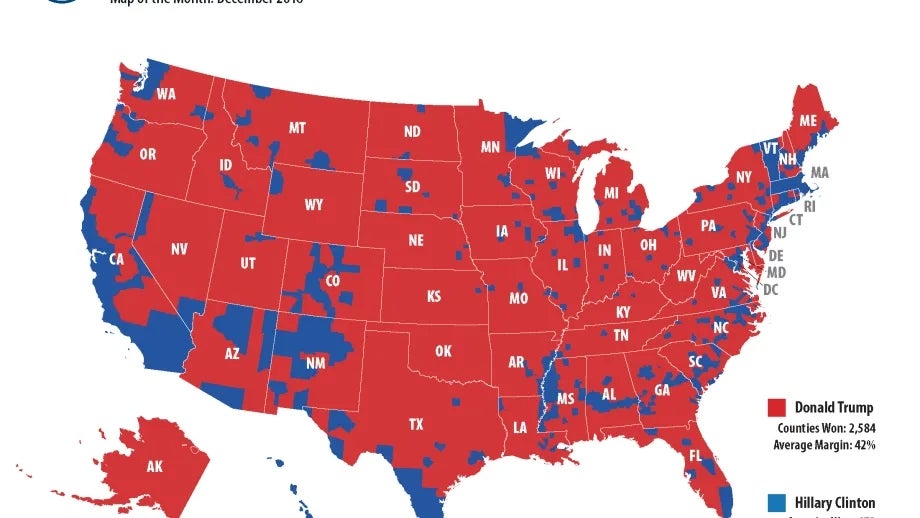
These maps provide three different views of the recent presidential election. The first map shows county-by-county results in the traditional red and blue colors. From a transportation perspective, one clear takeaway is that you could drive coast-to-coast without ever setting foot in a Clinton County. The second map comes courtesy of the Brookings Institution, and it tells a dramatically different story. While Secretary Clinton carried 2,000 fewer counties than Mr. Trump, her blue counties represent nearly two-thirds of the nation's Gross Domestic Product (GDP). Finally, the third map introduces some nuance to the stark contrast of the two other pictures. It depicts county-by-county results like the first map, but shows the margin of victory in a range of red and blue colors. The most striking thing to me about the third map is how many purple counties there are, where the vote margin was +/-10% for either Trump or Clinton. In other words, our closely divided county once again proved just how closely divided it is. My Christmas wish: that we can start emphasizing the close part more than the divided one.