Each month a new map is presented to the Commission to help explain important trends in the Bay Area, across the nation and around the world. These custom-crafted maps are prepared by MTC’s Data & Visualization team.
Each month a new map is presented to the Commission to help explain important trends in the Bay Area, across the nation and around the world. These custom-crafted maps are prepared by MTC’s Data & Visualization team.

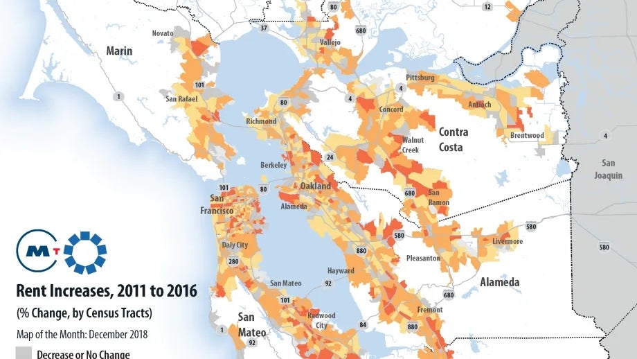
This map illustrates that, between 2011 and 2016, most places in the Bay Area experienced significant rent increases. Many communities saw rent increases of 40% or more in the five-year period. For too many lower income residents in our region, this meant living with friends and family, moving out of their neighborhoods to more affordable places further east, or becoming homeless. That’s the sobering reality of the Bay Area’s housing crisis.