Each month a new map is presented to the Commission to help explain important trends in the Bay Area, across the nation and around the world. These custom-crafted maps are prepared by MTC’s Data & Visualization team.
Each month a new map is presented to the Commission to help explain important trends in the Bay Area, across the nation and around the world. These custom-crafted maps are prepared by MTC’s Data & Visualization team.

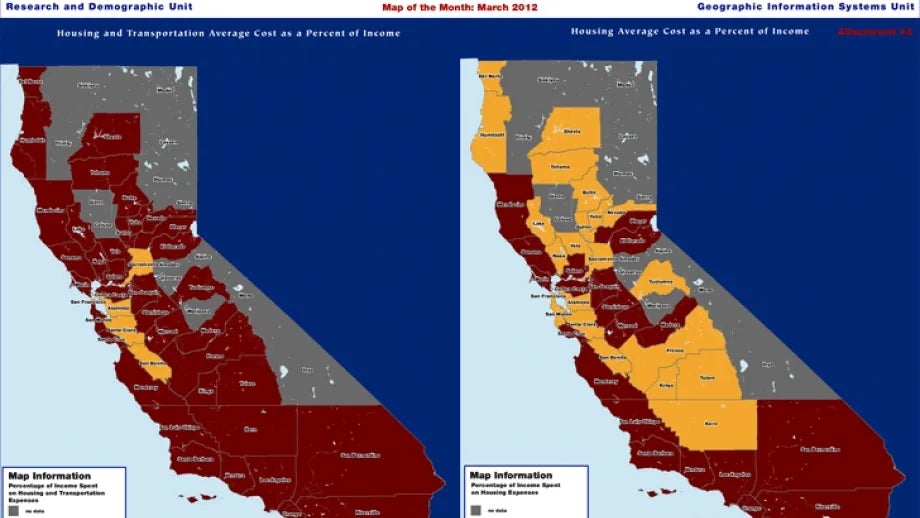
T he map shows the Center for Neighborhood Technology's Housing and Transportation (H+T) Affordability Index using 2009 American Community Survey Data. Compared side-by-side is the cost of housing as a percent of income (on the right) with the cost of housing and transportation as a percent of income (on the left) for an average household at the county level. The average housing cost of five Bay Area counties does not exceed 30% of average household income. When taking into consideration the added cost of transportation, however, only three Bay Area counties– Alameda, San Francisco, and Santa Clara- do not exceed the 50% threshold for combined cost.