Each month a new map is presented to the Commission to help explain important trends in the Bay Area, across the nation and around the world. These custom-crafted maps are prepared by MTC’s Data & Visualization team.
Each month a new map is presented to the Commission to help explain important trends in the Bay Area, across the nation and around the world. These custom-crafted maps are prepared by MTC’s Data & Visualization team.

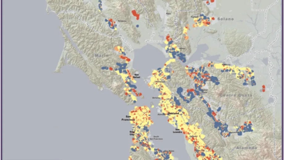
The map of the month shows recession-related changes in frequency, or headways, for daily bus, rail and ferry service between 2006 and 2009. The blue areas indicate service reductions (headways decreased) and the red areas indicate service additions (headways increased). While the map certainly has too much blue reflecting longer headways and waiting times for transit patrons, it is noteworthy how many red areas show improved service during this economic recessionary period. However, 2010 has been a very tough year financially for transit operations so we expect more service reductions than shown on the map.