Each month a new map is presented to the Commission to help explain important trends in the Bay Area, across the nation and around the world. These custom-crafted maps are prepared by MTC’s Data & Visualization team.
Each month a new map is presented to the Commission to help explain important trends in the Bay Area, across the nation and around the world. These custom-crafted maps are prepared by MTC’s Data & Visualization team.

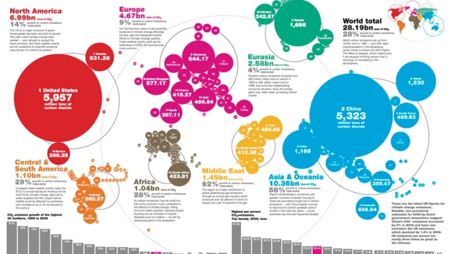
This map shows CO2 emissions in 2005 in million tons by countries around the world. The countries are generalized as circles that are proportional in size to the emissions. This shows the United States as the largest emitter and China in the number two position. When these data are expressed as per-capita measures, the United States falls into the 9th position and Qatar is the highest per-capita emitter. Securing an international agreement to reduce greenhouse gas levels by enough to save the earth from catastrophic temperate rises has been an increasingly challenging task for world leaders. This map, showing countries according to their emissions, shows why an international agreement is needed.